Welcome to The FOOD Intl Work Process. This document defines who we are, what we value, and how we present our identity across all platforms and locations. From communication to visual branding, our goal is to ensure consistency and clarity in every interaction.
To support this, CB Studio led a full rebranding of TFI—creating a new logo, stationery, and promotional materials. By understanding the challenges of daily operations and customer engagement, we developed a brand system that’s both practical and expressive. This care is reflected in every guest touchpoint—from the restaurant ambiance and visuals to the digital experience.
Jan Hermie Blanca stepped in and worked closely with Aldren Depra and Margiory Cafe on establishing the parameters and creative direction of the TFI ads goal. What could have taken weeks, if not months to develop, was shortened to days.
“Given the clarity we had regarding the desired direction, the TFI identity practically materialized effortlessly, as if it had a design of its own.”
JAN HERMIE BLANCA, CEO
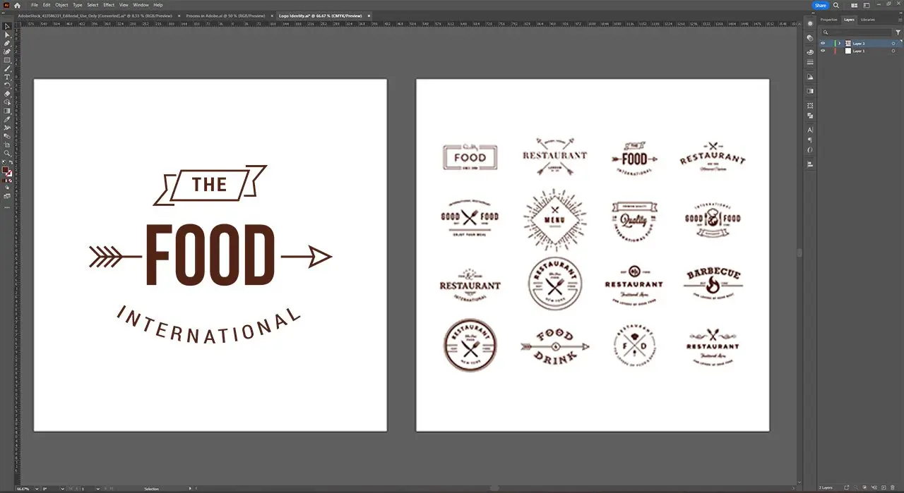
Identity Design
Hand in hand, we embark on a collaborative journey to create an authentic, captivating, and visually striking portrayal TFI brand identity system. With meticulous research and an unwavering commitment to excellence, we explore countless possibilities, continuously refining our ideas until we achieve a cohesive and flexible identity system that encapsulates your essence.
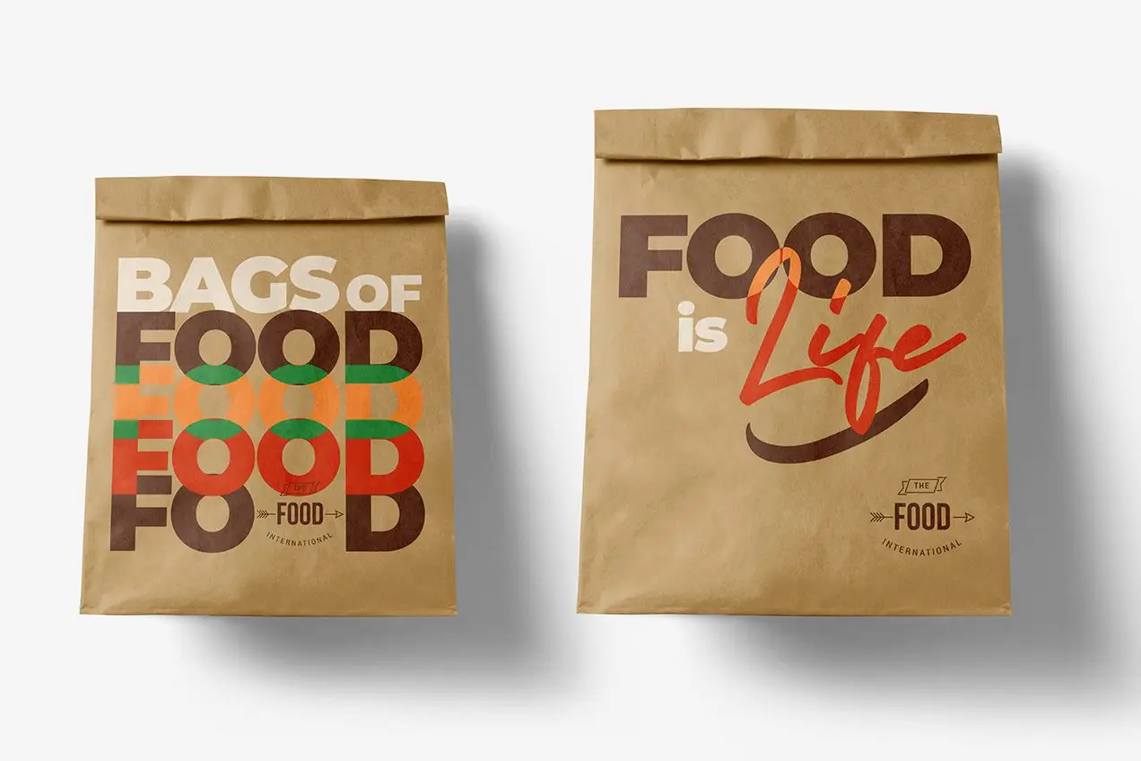
Brand Colors
Vibrant, diverse, and fun. The TFI brand colors embody the spirit of its dynamic environment, serving as a visual representation of its bold and exciting nature. Furthermore, these colors play a crucial role in color-coding and organizing various design systems throughout the brand.
We updated the typeface of the brand to be playful, modern, and clean, with just enough character. A typeface flexible enough to work well across large printed displays down to small digital screens.
Credits
CLIENT
The FOOD Intl
CREATIVES
Alex Jordan, Casey
PRODUCER
Frederick Oliver Owen Daniels
PRODUCTION STUDIO
CafeBlanca Studio
CREATIVE DIRECTOR
Jan Hermie Blanca
EXECUTIVE PRODUCER
Aldren Edric, Margiory Cafe
POST PRODUCER
Jan Hermie Blanca
DESIGNER
Jester Hans Blanca
EDITOR
Jan Hermie Blanca
SOFTWARE
Illustrator, Photoshop, Indesign, XD, After Effects, Premiere Pro